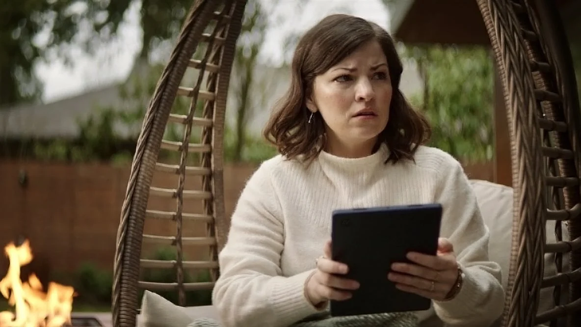
For “The Rental” — Bell’s first-ever Super Bowl spot — we turned a family’s perfect getaway into a chilling horror story when they discover the unthinkable: a vacation without Bell pure fibre Internet.
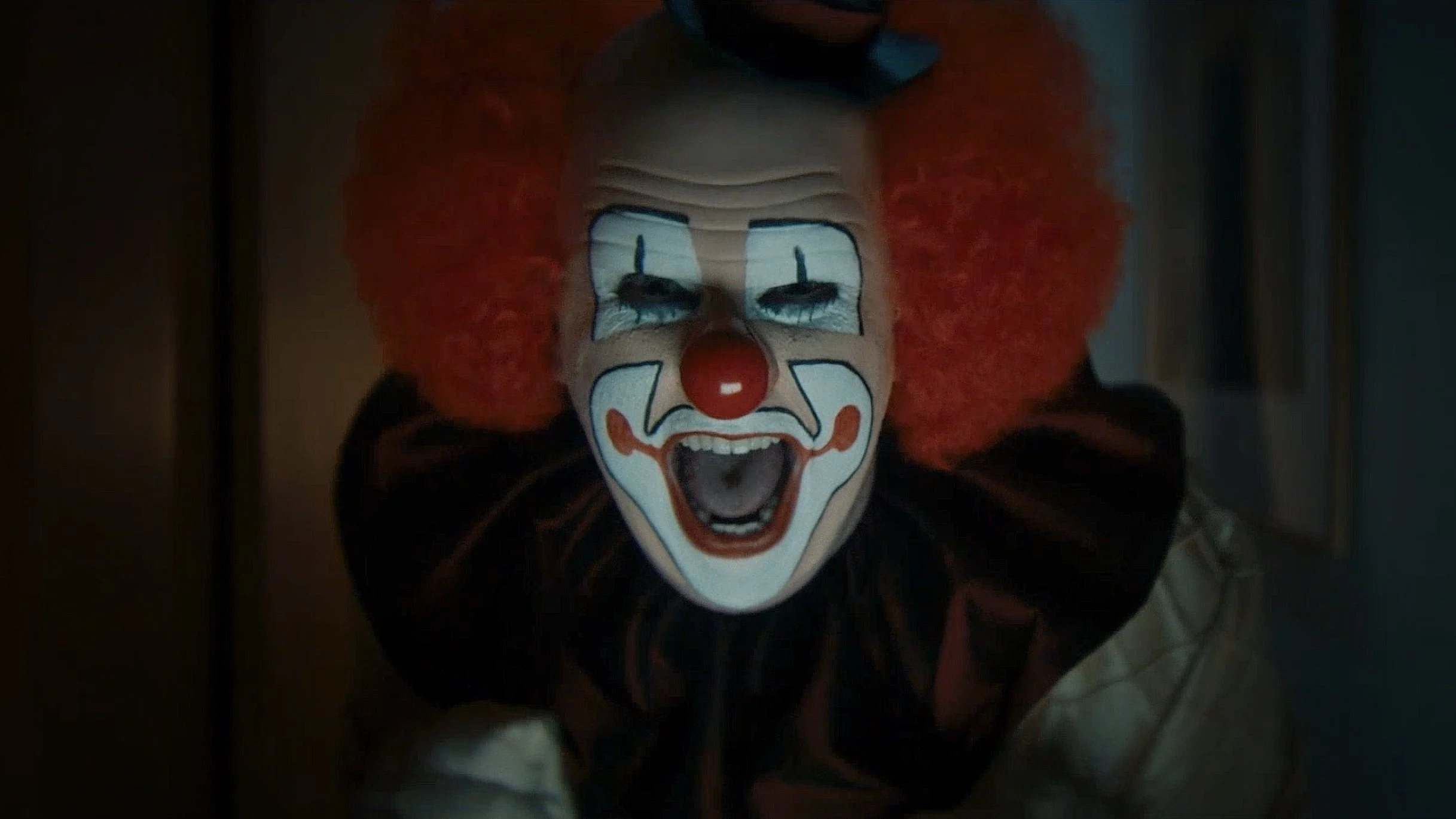
In “The Visitor” — the sequel in this double-feature screamfest — we take viewers into a nightmare realm where a man is being pursued by his greatest fear… until he comes face-to-face with one even greater: his home has cable Internet.
Both spots urge Canadians to switch to Bell, because once you’ve experienced Bell pure fibre Internet, anything else is terrifying.
FUN FACT: The man playing our clown was the loveliest human in the world.
MEDIA: OLV/broadcast, cinema, digital
WRITER: Jason Sweeney
CREATIVE OFFICER: Lisa Greenberg
PRODUCTION: Aircastle (Soft Citizen); Leigh Marling (Animals)
Nobody likes stinky clothes. But odors that won't leave, even after multiple washes? It's like being stuck in a toxic relationship.
We tell the story of one woman's escape from despair to liberation in a powerhouse performance scored with the most badass breakup song ever: Bonnie Tyler's power ballad "Total Eclipse of the Heart" (with a few teensy tweaks to the lyrics).
FUN FACT: I had to sing this song to client 37 times before we got to production.
MEDIA: Digital, OLV/broadcast; EN/FR/SP
WRITER: Jason Sweeney
Creative Officer: Steve Persico
PRODUCTION: Prettybird
SCORE: Grayson Music
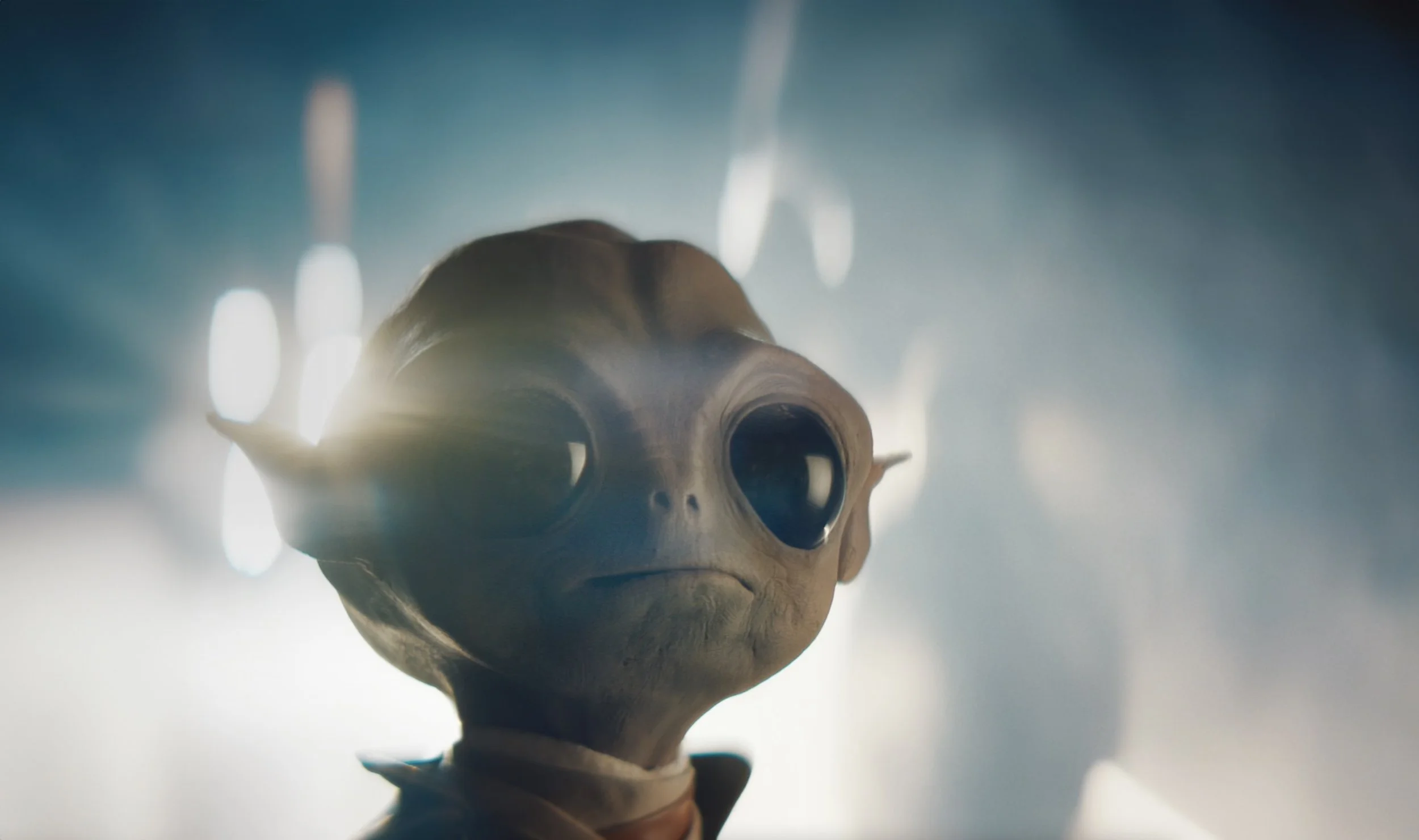
In "Intelligent Life", humankind has made peaceful first contact with an alien race. Select Earthlings are boarding an alien spacecraft to experience the wonder of galactic civilization... except for one guy who just has to ask what the 5G is like out there.
Launching on TV, cinema, and online, "Intelligent Life" stands on the shoulders of classic first-contact stories — even going so far to as to create the most adorable alien this side of Alpha Centauri — all to help Canadians realize one thing: if the 5G is that good, I have GOT to get on board.
FUN FACT: Our alien—Merpy—didn’t have a head until 5 minutes before shooting.
MEDIA: Digital, OLV/broadcast
WRITER: Jason Sweeney
CREATIVE OFFICER: Lisa Greenberg
PRODUCTION: Animals
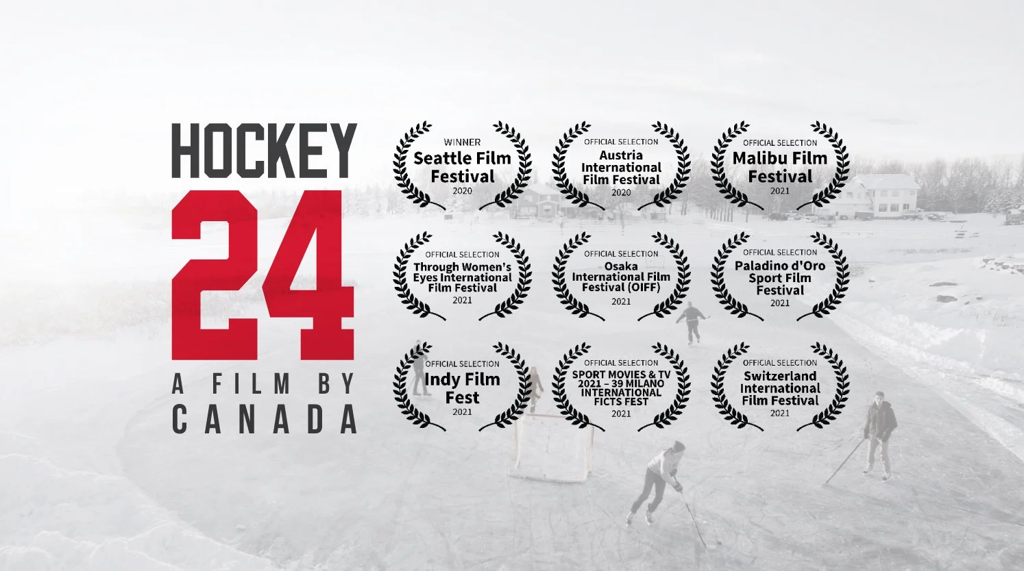
Scotiabank is all-in on hockey. So to honour that commitment, we invited the nation to join award-winning documentary filmmakers in capturing a single day in the life of community hockey. With the help of P.K. Subban and Auston Matthews, we triggered an avalanche of submissions from everyday Canadians. From there, we crafted a feature-length documentary bursting with laughter, tears, and poignant stories of diversity and inclusion. Watched by over half a million Canadian households the night of its broadcast premiere, the film went on to be honoured at advertising award shows and film festivals in 11 countries.
FUN FACT: To make this all happen in one day we had the biggest pre-pro ever, with 12 production teams in one meeting.
WHAT I DID: concept development, brand identity design, UGC story mining
MEDIA: OLV/broadcast, digital, social, in-branch
WRITER: Jason Sweeney
CREATIVE OFFICER: Hayes Steinberg
EDITORIAL: Emily Preston, Yanyu Lung
PRODUCTION: The Mark, Hot Docs Studios
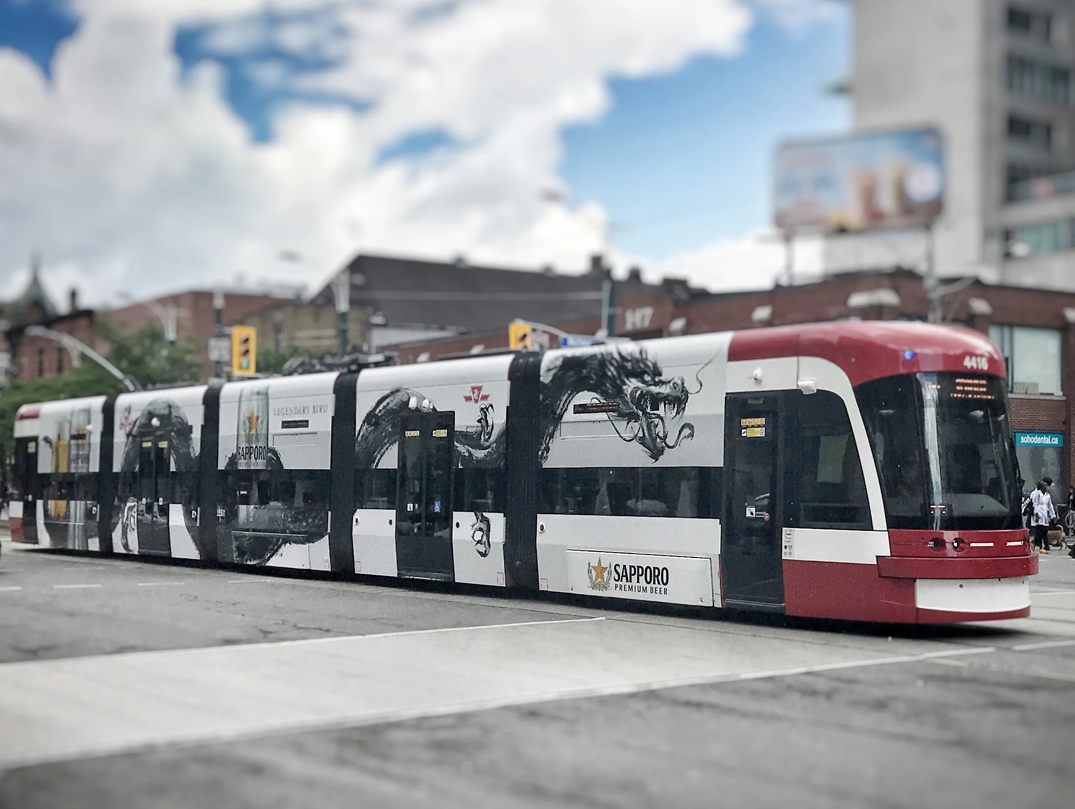
Sapporo wanted to boost their image as a beer with sophisticated urban cred. So we created a transit domination that combined traditional sumi-e brushwork with the edginess of nightlife in modern Japan. Bystanders were treated to the spectacle of giant dragons snaking along city streets, and passengers were surprised to step into interiors decked-out to resemble Tokyo subway cars. 乾杯 !
WHAT I DID: concept development, animation supervision
MEDIA: Transit, wild postings, digital
WRITER: Siobhan Dempsey
CREATIVE OFFICERS: Travis Cowdy, Lyranda Martin-Evans
PRODUCTION: Brad Pickard; Married to Giants
Manulife wanted to let Canadians know that when armed with a financial plan, they’ll have the courage to pursue the things that matter most. We brought this to life by following in the footsteps of people as they embarked on life-altering journeys; some bold, others quietly personal. A series of follow-up shorts each told the story of a character and how Manulife helped bring their unique ambitions to life.
FUN FACT: The schoolteacher in this spot was our crew chaperone, switched in at the last minute.
MEDIA: Digital, cinema, OOH
WRITER: Julie Stolberg
CREATIVE DIRECTOR: John Frier
PRODUCTION: Soft Citizen
To help The Beauty Clinic by Shoppers stand out in a sea of air-brushed sameness, this campaign flipped the script on what people expect from the cosmetic dermatology industry. With a refreshing injection of levity, this micro-targeted social campaign smashed all expectations: generating 1.2 million views, doubling our goal for consultation requests, and winning a CMA to boot. Fabulous!
WHAT I DID: concept development, brand identity design
MEDIA: OLV/broadcast, digital, social, in-store
WRITER: Jason Sweeney
CREATIVE OFFICER: Hayes Steinberg
PRODUCTION: Nimble
Kruger created The Big Assist to help keep hockey kids in need on the ice, because while hockey may be expensive, the lessons it teaches are invaluable. Grownups know that an "assist" is more than just a pass that makes a goal possible, but we wondered if kids did too. So we asked them, and let them teach us in their own charming way. The campaign exceeded expectations, doubling submissions over the previous year.
FUN FACT: Our director—Nolan Sarner—is known as “the child whisperer” for his ability to bring nuanced performances out of squirmy kids.
MEDIA: Digital, OLV/broadcast
WRITER: Jason Sweeney
CREATIVE OFFICER: Hayes Steinberg
PRODUCTION: Skin and Bones
What to do with that empty soda can? Choose wisely or Karma’s gonna get you. Encorp Recycling wanted to remind kids and adults alike not to trash their recyclables. This doodly campaign took it to the extreme, showing how a careless mistake can have unexpected (and sometimes squashy) consequences.
FUN FACT: Our client nearly nixed the whole campaign because the Party Punch spot was maybe just a touch too violent. Even for stick people.
MEDIA: Digital, print, OOH
WRITER: Tim Dundon
CREATIVE DIRECTOR: Kai Clemen
ANIMATION: Paul Gill
At the peak of the pandemic, Shoppers Drug Mart pharmacists were among the few healthcare providers Canadians felt comfortable visiting. But most of us didn't realize our local pharmacist could diagnose and prescribe for a host of ailments, just like a doctor. We used a familiar retail setting to deliver this unfamiliar news, and jumpstarted a change in behaviour that our overburdened medical system needed.
MY ROLE: concept development, CGI direction
MEDIA: broadcast/OLV, digital, social, in-store
WRITER: Jason Sweeney
CREATIVE OFFICER: Hayes Steinberg
PRODUCTION: Nimble
I love nothing more than building a brand from the ground-up or reimagining one in need of a renovation.
Sophisticated? Mais oui. Playful? Yippee! Seductive? Ooh baby.
From logos to labels to livery, I’m an expert at getting a brand ready for its closeup.
Homeowners have been conditioned to believe that all mortgages are the same. Manulife One is the vastly-superior exception, so why do so few Canadians know about it? It’s almost as if there’s a shadowy bank conspiracy to keep us in the dark. We awakened consumers by creating an underground resistance intent on bringing the mortgage truth to light. Decidedly un-banky.
This digital campaign drove 14 million views, grew business 30% year-over-year and generated tens of millions dollars for our client. Winner of gold and silver CMA awards; plus a Cassie for good measure.
MY ROLE: concept development, brand identity design, VFX supervision
MEDIA: OLV/broadcast, digital, social
WRITER: Rich Cooper
CO-CREATIVE DIRECTORS: Travis Cowdy, Lyranda Martin-Evans
PRODUCTION: Nimble
The challenge: make some dumb old coral reefs look interesting. Oh—who are we kidding?—the sea is a weird, wonderful, magical place. This fun little campaign dove in to follow one miniature family on their aquatic adventures. The real challenge: getting a school of jellyfish to face the camera.
MEDIA: OOH, digital, environmental graphics
CREATIVE DIRECTOR: Matt Bielby
PHOTOGRAPHY AND RETOUCHING: The Orange Apple
Like it or not, we share the highway with some pretty big rigs. The Insurance Corporation of BC wanted to remind drivers to keep their wits about them to avoid getting clobbered. We made our point by turning an unhappy VW Bug into a splattered casualty.
FUN FACTS: We sourced a for-real dead VW Beetle and suspended it from a forklift for just the right effect. The guts were raspberry jam.
WRITER: Jason McCormick
CREATIVE DIRECTOR: Kai Clemen
PHOTOGRAPHY: Anthony Redpath
MEDIA: Print, OOH
What can you say about natural gas? Once you get past all the fart jokes, the options get a little dull. We wanted to let consumers know that not only was BC Gas changing it’s name, they were also bringing choice to a category that traditionally offered none. Enter Julie: BC Gas’ fast-talking receptionist. She was anything but silent, and the business results were deadly.
FUN FACT: This was my first-ever spot, and I still think it’s pretty dang funny, even with the old-timey 4:3 aspect ratio.
MEDIA: Broadcast, print
WRITER: Tim Dundon
CREATIVE DIRECTOR: Kai Clemen
PHOTOGRAPHY: Hans Sipma
PRODUCTION: Steam


![MillerThomson110415[5]_KDS_Page_5.jpg](https://images.squarespace-cdn.com/content/v1/5963fec46a4963189383e029/1499885946704-Z2468S8AM0CV0WP8WHRT/MillerThomson110415%5B5%5D_KDS_Page_5.jpg)


